BeWell
Designing a social platform for users to browse, share, and build healthy habits
I set out to solve a familiar problem: how do we make health more meaningful than numbers on a scale? BeWell became my answer—a platform that flips the typical health app model on its head by focusing on habits and human connection, not calories burned or miles run. Through thoughtful design and relentless testing, I sought to craft an experience that empowers people to live healthier lives, one step at a time.
My role
UX Designer
User research,
Information architecture,
Wireframes,
Mockups,
Prototypes,
Usability studies,
Accessibility
Team
This project was completed as part of the Google UX Certificate. Check out my real client case studies.
Project duration
December 2022 –
January 2023
Solving the gaps in traditional health apps
Most health apps are limited to a single aspect of well-being, making long-term change hard to sustain. BeWell tackles the problem by integrating all aspects of health into one cohesive experience. Rather than pushing users to aim for a number, BeWell encourages small, incremental changes and the support of a social community, leading to more meaningful, lasting habits.
Think Pinterest, but healthier
The goal was ambitious: create a platform that inspires holistic wellness by integrating all aspects of health—from mental well-being and nutrition to exercise and mindfulness. BeWell’s mission is to help users build lasting healthy habits through personalized content and genuine human connection.
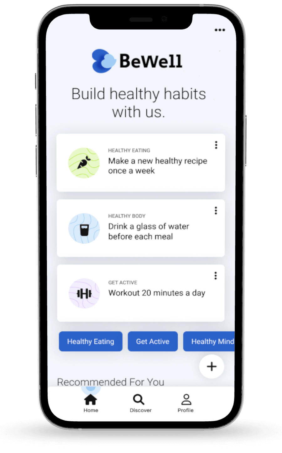
Build habits
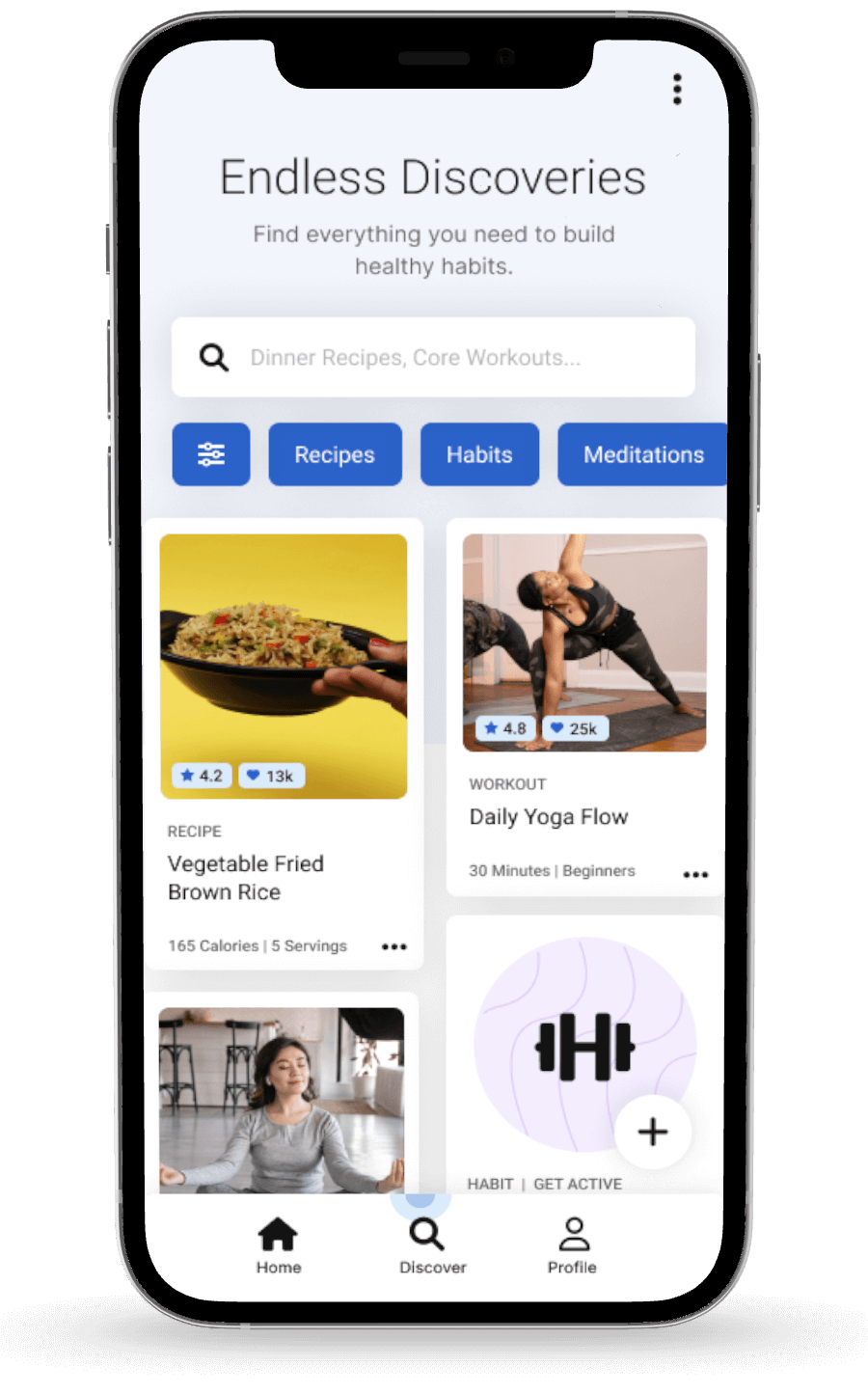
Discover content
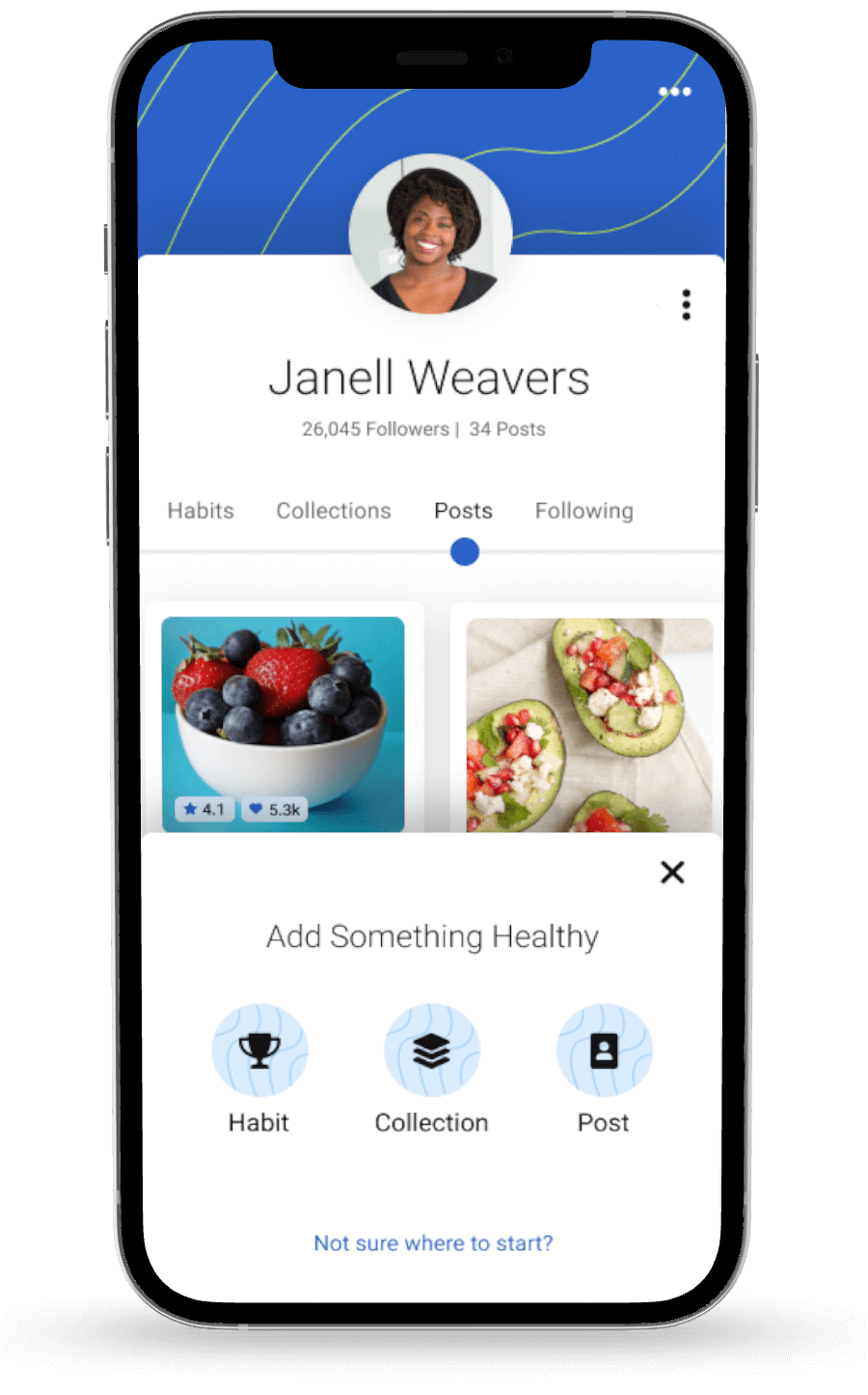
Create inspiration
Uncovering the secrets to sustainable habits
It all started with understanding human behavior. I researched what motivates people to change their habits and what obstacles stand in their way. To get authentic insights, I spoke directly with users. What I learned shaped every decision that followed:
- People are more likely to stick with small, achievable goals.
- Easy access to health content, such as workouts or healthy recipes, drives engagement
- People are more likely to succeed when they feel safe and supported by a community.
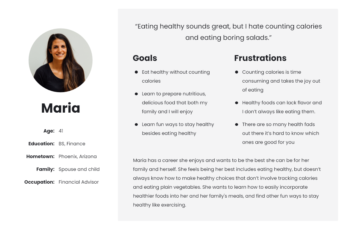
User persona
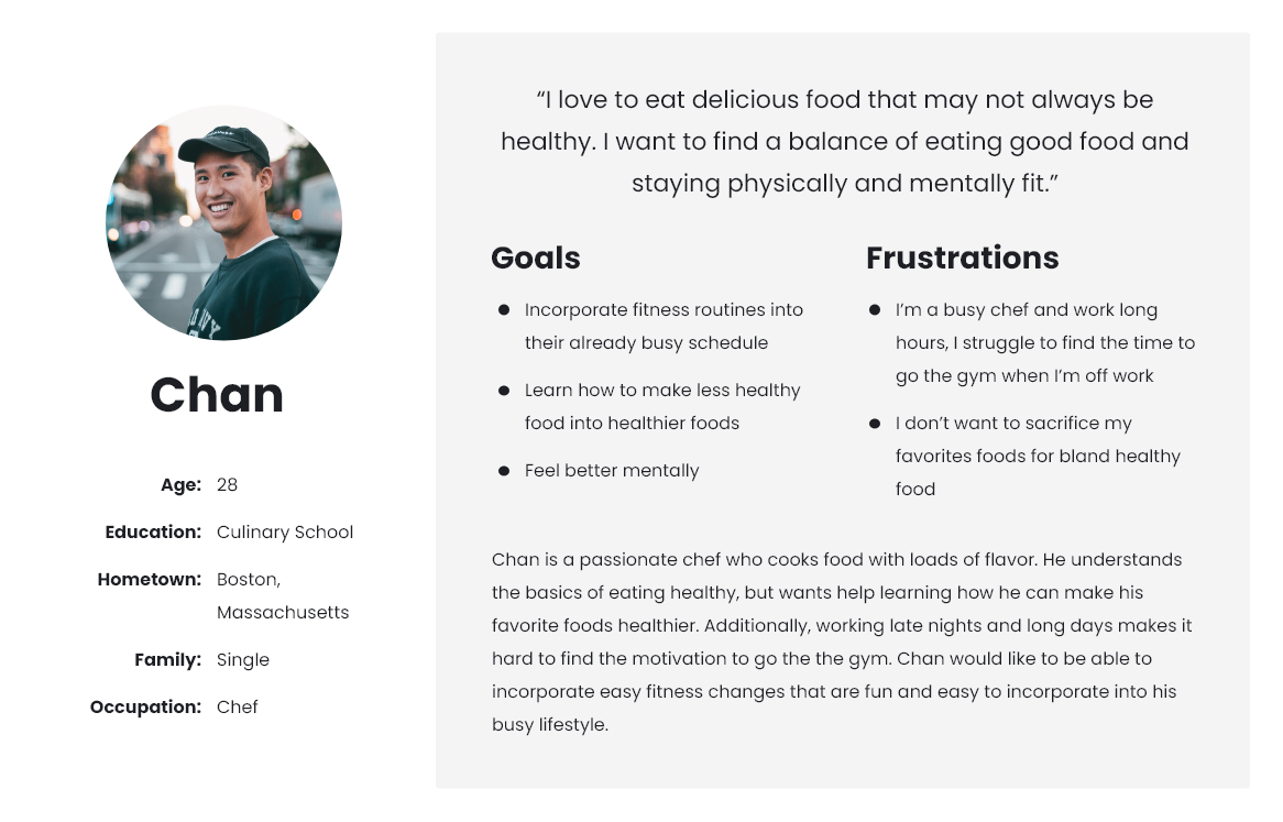
User persona
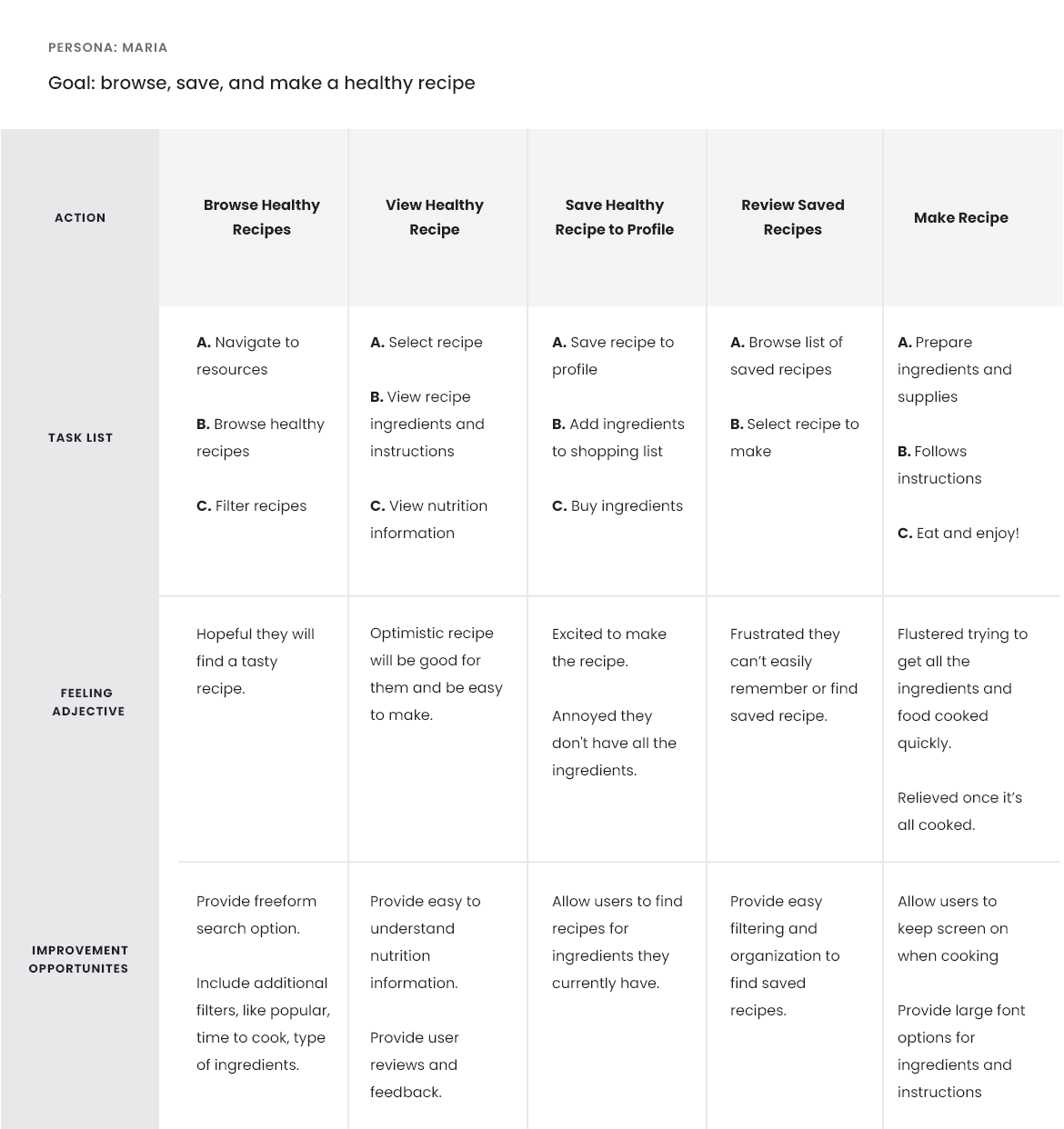
User journey
Real stories, real challenges
Behind every design challenge are real people with real stories. As I dove deeper into understanding the needs of BeWell’s users, I encountered unique challenges that shaped the direction of the solution.
Problem statement
Maria, a busy working mom, struggles to find time for regular exercise and healthy meal planning, impacting her overall well-being.
Problem statement
Chan, a chef who works late, needs support to start and maintain healthier habits to improve his mental health and boost his energy levels.
User story
As someone who doesn’t like exercise, I want to learn how to easily incorporate fun exercises into my daily routine so that I have more energy.
User story
As someone with a stressful life, I want to strengthen my mental health so that I can relax and live a more stress-free life.
Dream, doodle, design
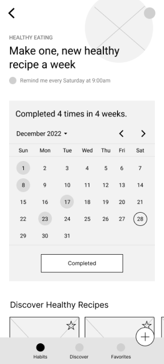
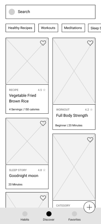
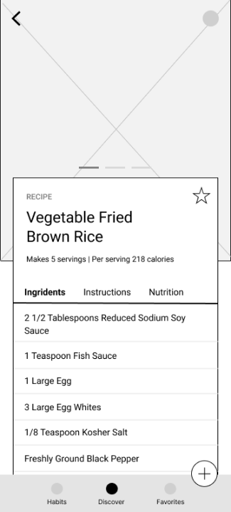
Mobile app wireframes
Home
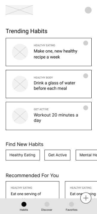
Track habit
Search content
View recipe
Website sitemap
Putting wireframes to the test
The wireframes evolved into prototypes that were shared with users in moderated usability studies. I tested assumptions, validated interactions, and refined designs based on user feedback. A few standout findings emerged:
User feedback
Users had trouble locating their habits, making it hard to track progress.
Design change
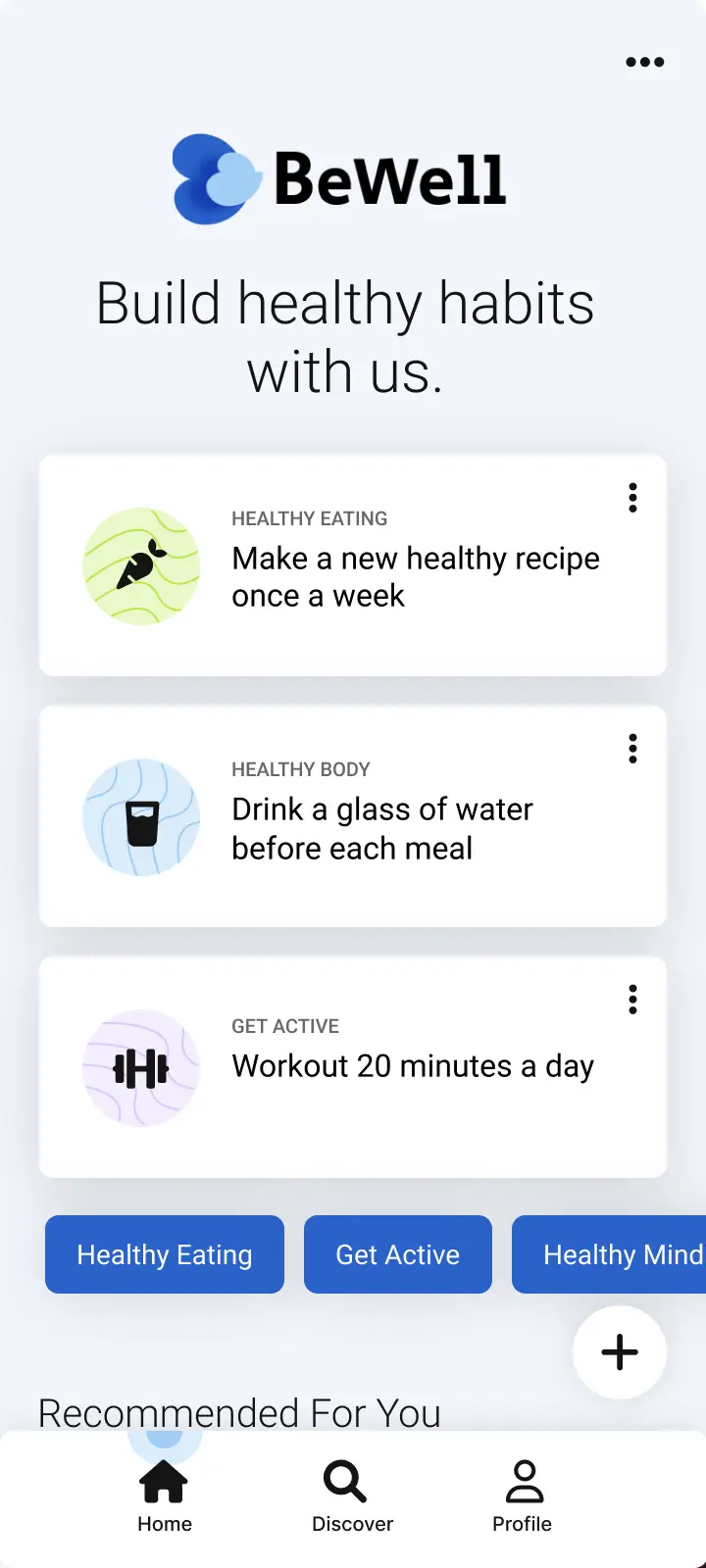
The app’s home screen would display habits that users track for quick access.
User feedback
The ability to “favorite” posts was confusing. Users didn’t know how to access them.
Design change
Replaced the favoriting feature with the ability to save posts and habits.
User feedback
Users found it confusing to browse new habits and content on separate screens.
Design change
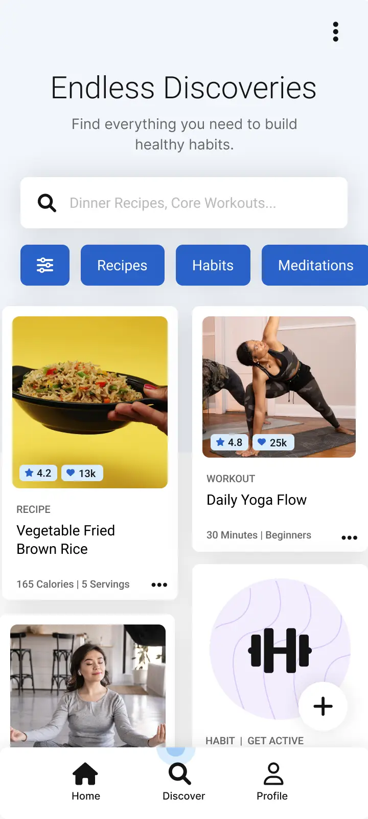
Created a single location to browse for both healthy habits and health content.
Designing with tranquility in mind
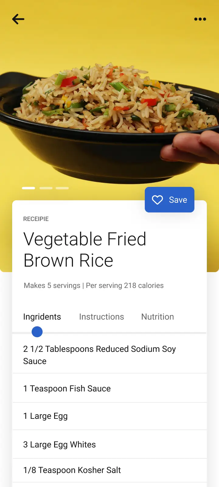
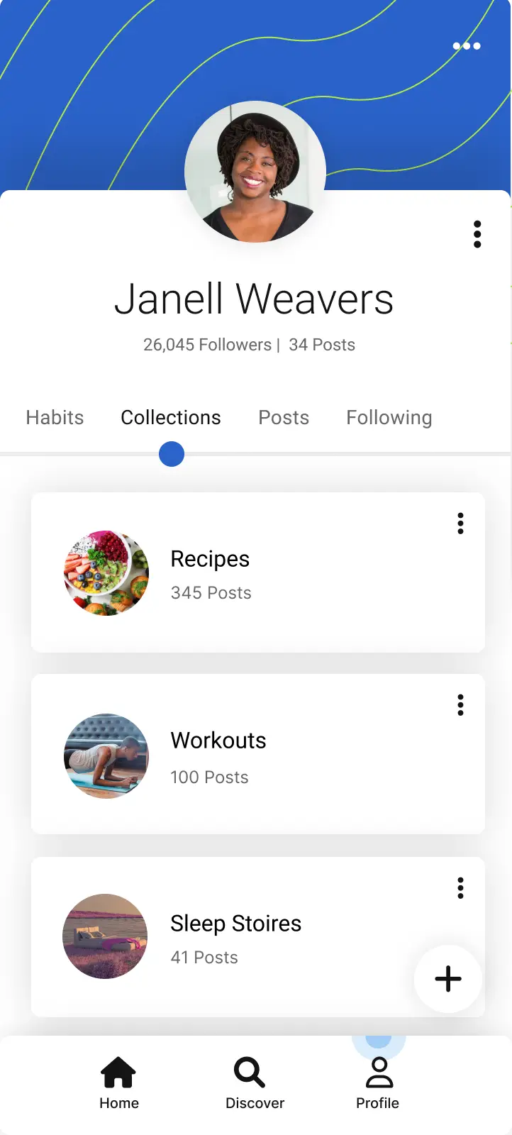
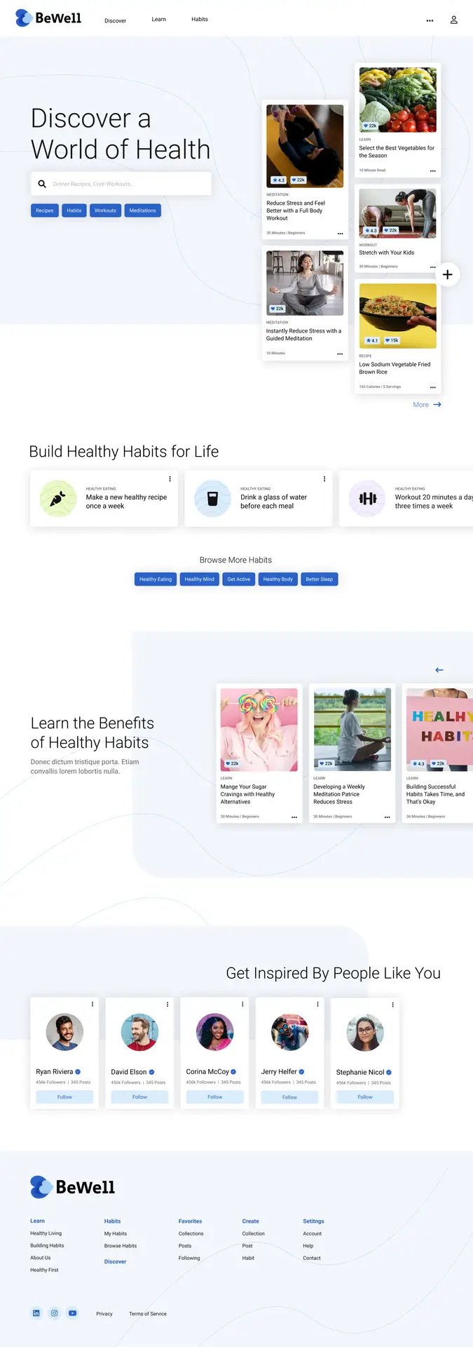
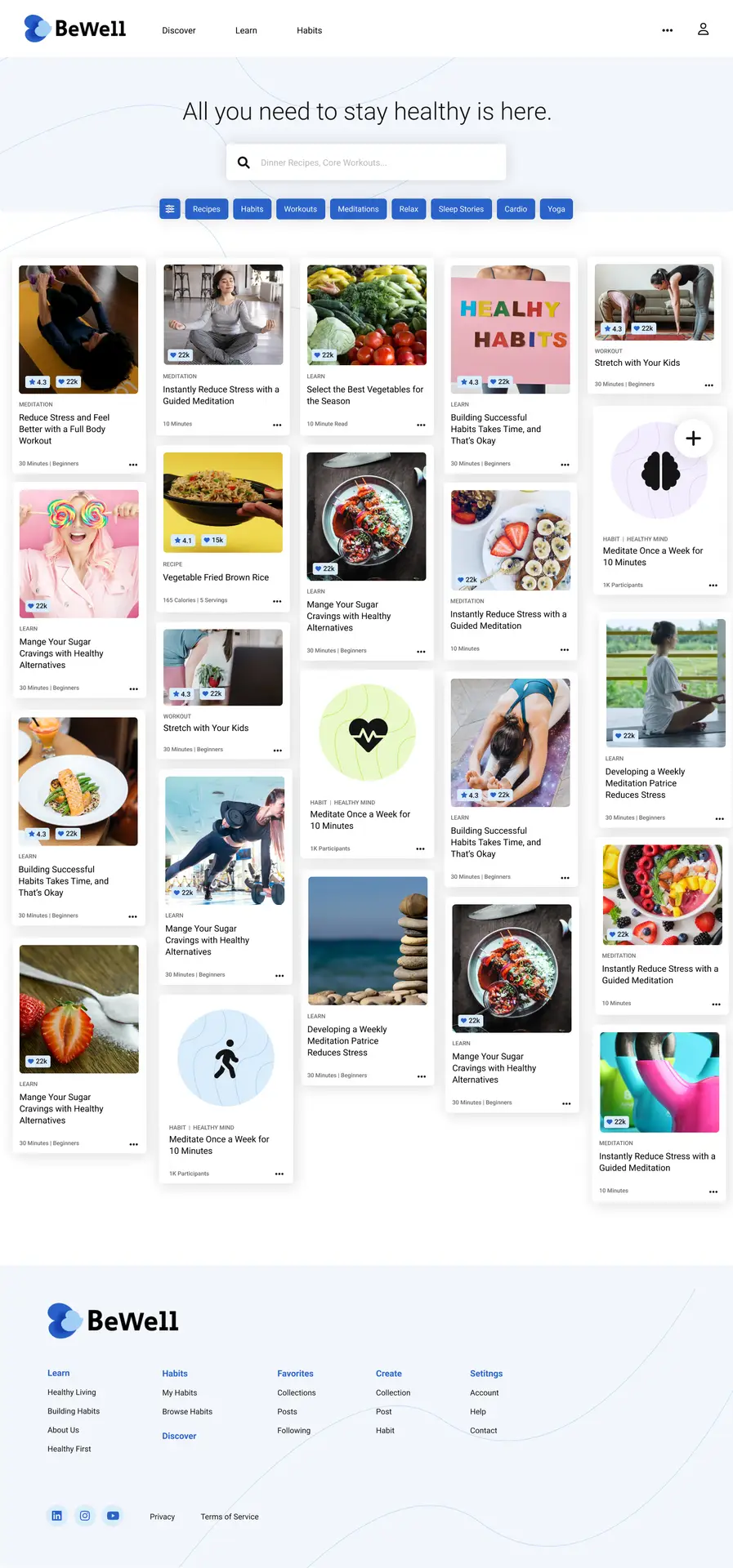
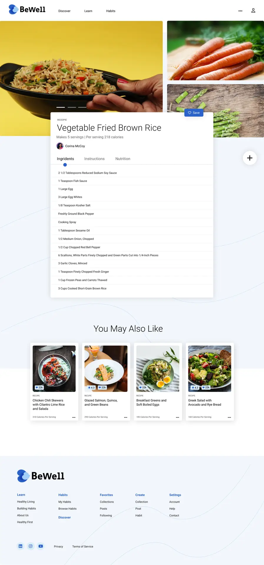
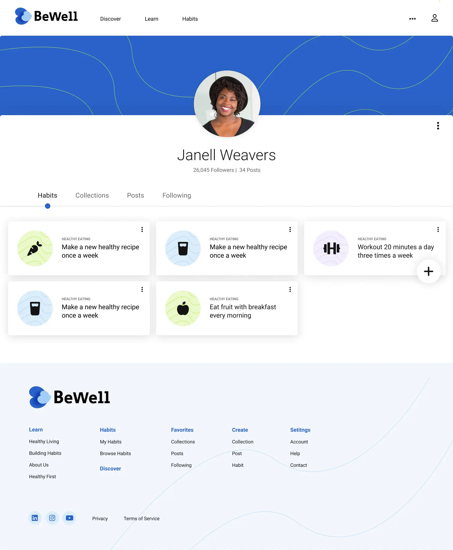
With validated concepts, I moved into high-fidelity mockups. I wanted BeWell to feel simple, welcoming, and aligned with the health and wellness theme. To achieve this, I chose pastel colors like soft blues and greens that evoke a sense of tranquility and well-being.
Mobile app mockups
Home
Search content
View recipe
Profile - collections
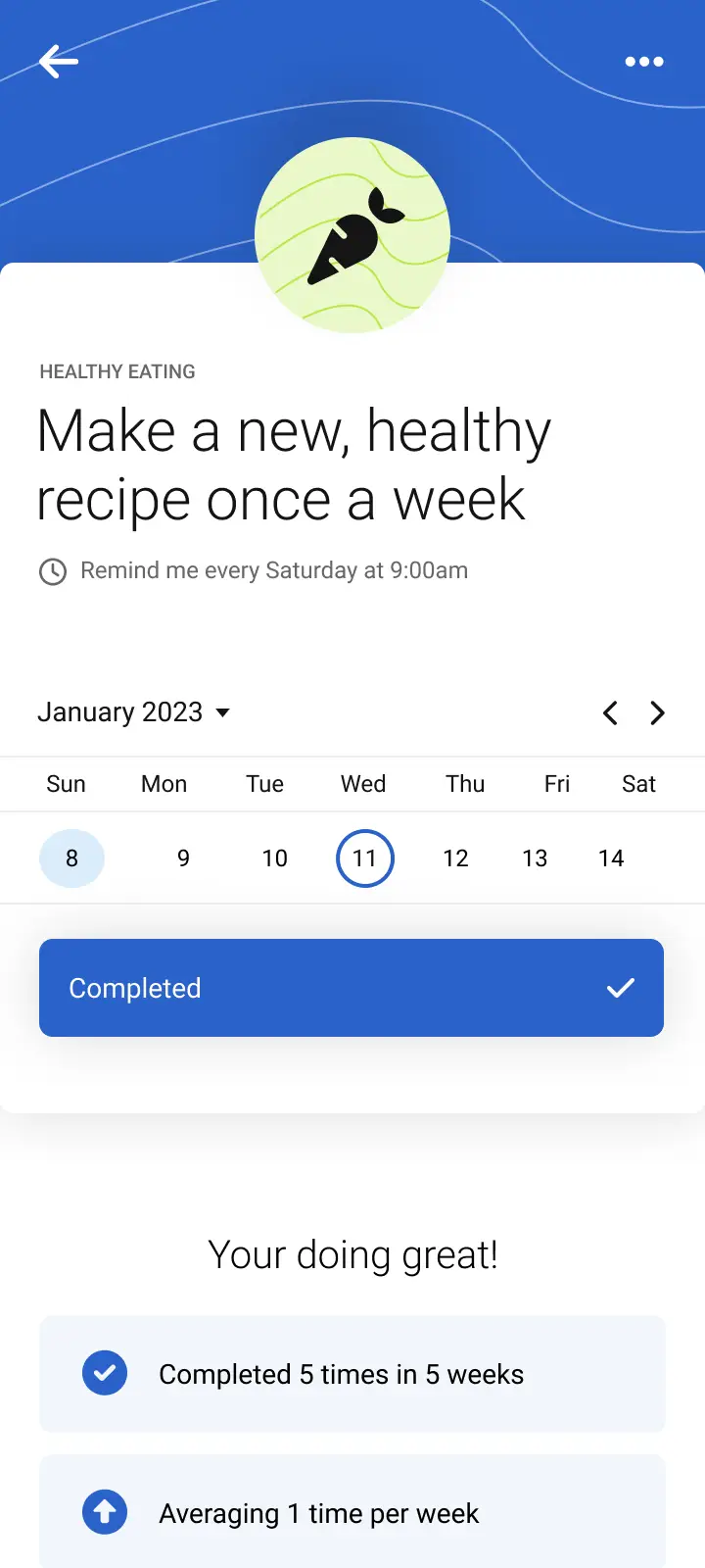
View habit
Desktop mockups
Home
Search content
View recipe
Profile - habits
Designing for everyone
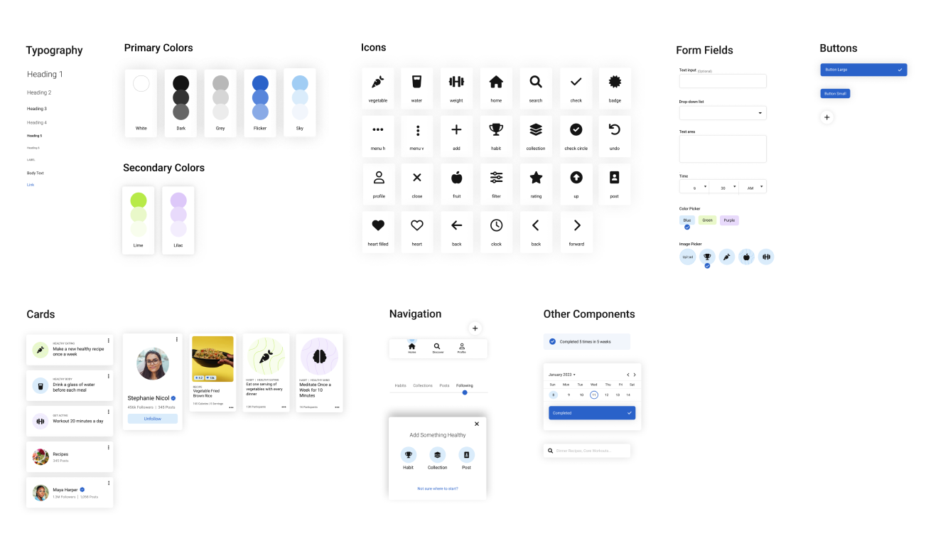
Accessibility was a core focus from the start. I built a unified design system that adhered to WCAG guidelines, ensuring everything—from font sizes and colors to interactive elements—could be used by everyone. This meant larger fonts, minimum contrast requirements, and labels that work seamlessly with screen readers.
Design system
Testing early and testing often
Continuous testing and iteration were at the heart of the BeWell project. I applied feedback at every stage—whether from wireframes, prototypes, or mockups. I ensured that we not only met users’ needs but also created a product that felt effortless and intuitive.
Lessons learned along the way
Every design journey is a story filled with challenges, learnings, and victories. Building BeWell taught me that creating a new product requires deep empathy and constant adaptability.
Small changes, big impact
Throughout the process, I learned that even minor design tweaks can significantly enhance usability. A simple adjustment to the navigation or rephrasing of a label often made workflows feel more intuitive for users.
Managing idea overload
Brainstorming generates countless possibilities, but focusing on what truly solves user pain points is key. Prioritizing ideas and keeping the user at the center helped me turn a flood of concepts into a clear, cohesive design.

