Resource Data
Transforming a fragmented Intranet into a unified, user-centered design system that streamlined workflows and improved usability.
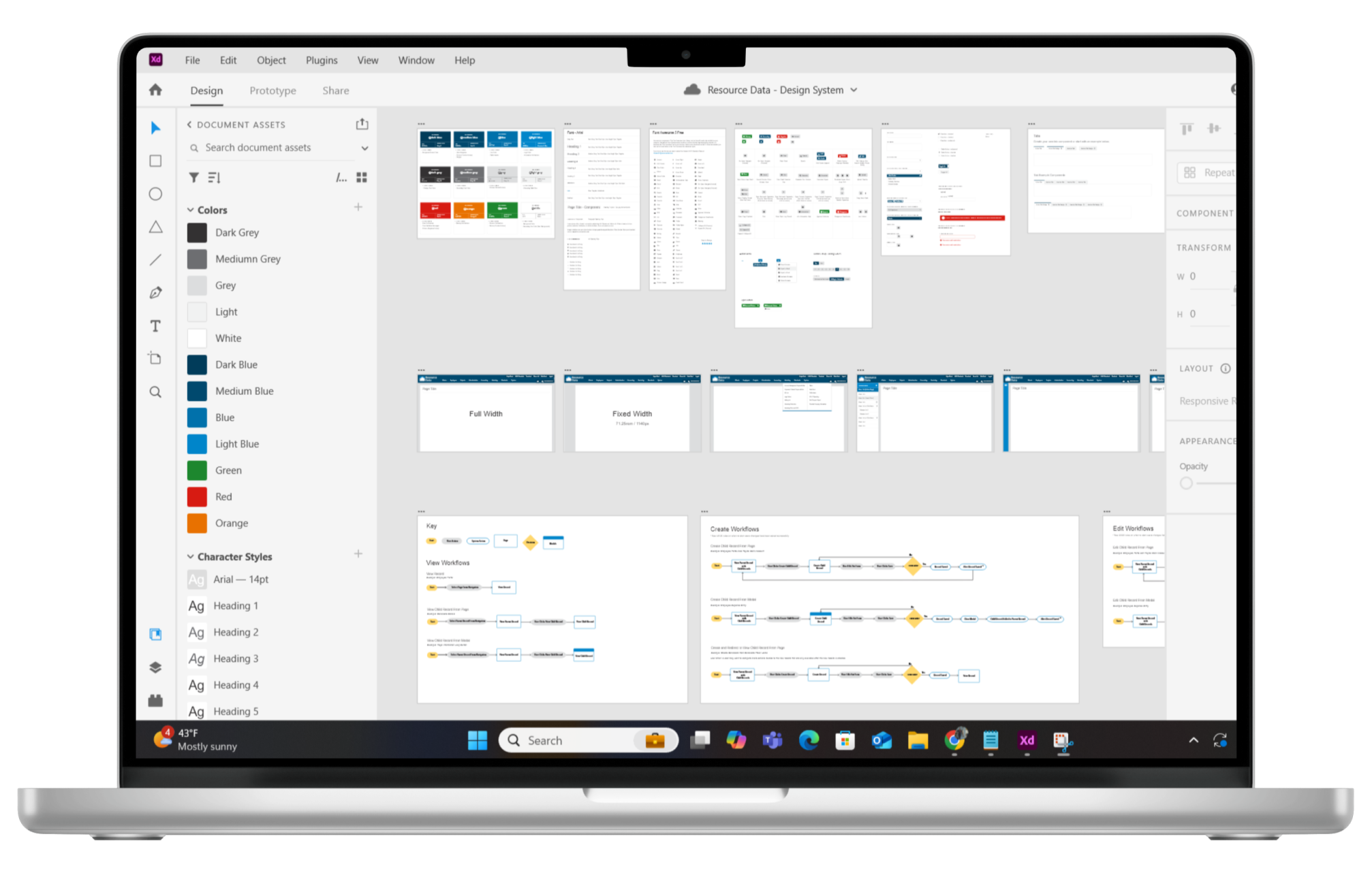
Important: Due to confidentiality requirements, images of Resource Data’s Intranet cannot be displayed.
Resource Data, a software consultancy, relied on an Intranet of internal tools—like time tracking, recruitment, and project management—built over decades by different developers. This patchwork system led to inconsistent interfaces and inefficiencies for its 200+ daily users. To address this, a UX Design Standards team was formed to define and standardize UI elements, streamline workflows, and create a cohesive design system.
My role
UX Designer
User research,
Workflows,
Wireframes
Mockups,
Prototypes,
Accessibility,
HTML/CSS,
JavaScript
Team
Project Manager (x1)
UX Designers (X4)
Developers (X4)
Stakeholders (x10)
Project duration
December 2017 –
September 2022
A quest for consistency
Imagine landing on a page with over five different primary buttons—labeled “Save,” “Submit,” “Update,” or even “Save Changes”—all performing the exact same function. Or worse, you may lose your updates because another user opens the same page simultaneously. These frustrations were just the beginning. Our UX Design Standards team faced the monumental challenge of standardizing the Intranet UI and workflows across over 100 complex pages. With diverse stakeholders, each holding strong opinions about their tools, our mission was clear: bring order to the Intranet while ensuring every user and stakeholder felt heard.
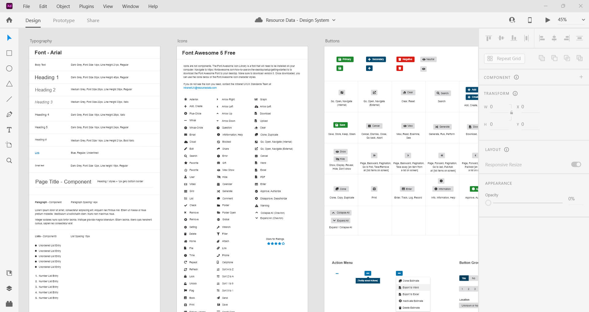
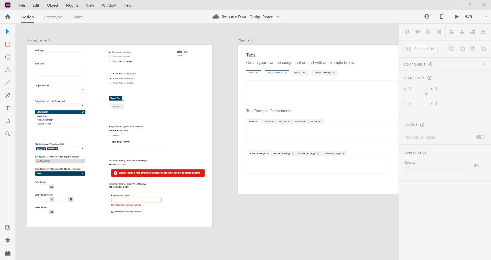
A design system snapshot
Understanding the users behind the screens
Before diving into the design overhaul, we set out to understand the everyday heroes of the Intranet. From project managers juggling tasks to HR staff handling sensitive info, each brought their own workflows, quirks, and priorities to the table.
Research task
Audit elements
We meticulously cataloged every button, date picker, and table style across the Intranet, documenting their use cases, inconsistencies, and quirks.
Research task
Stakeholder interviews
We uncovered pain points, needs, and motivations. Were requests based on personal preference or critical business requirements?
Research task
Accessibility goals
We defined clear benchmarks to guide every design decision, ensuring the final system delivered consistent, intuitive, and inclusive user experiences.
The anatomy of our design system
Forms
Text fields, dropdown lists, multi-select dropdowns
Date Pickers
Single date, date range, week pickers
Buttons
Primary, secondary, split buttons, button groups
Tables
Sortable, filterable, editable tables
Icons and Badges
Status indicators, progress markers
Navigation Menus
Primary navigation, secondary navigation
Indicators
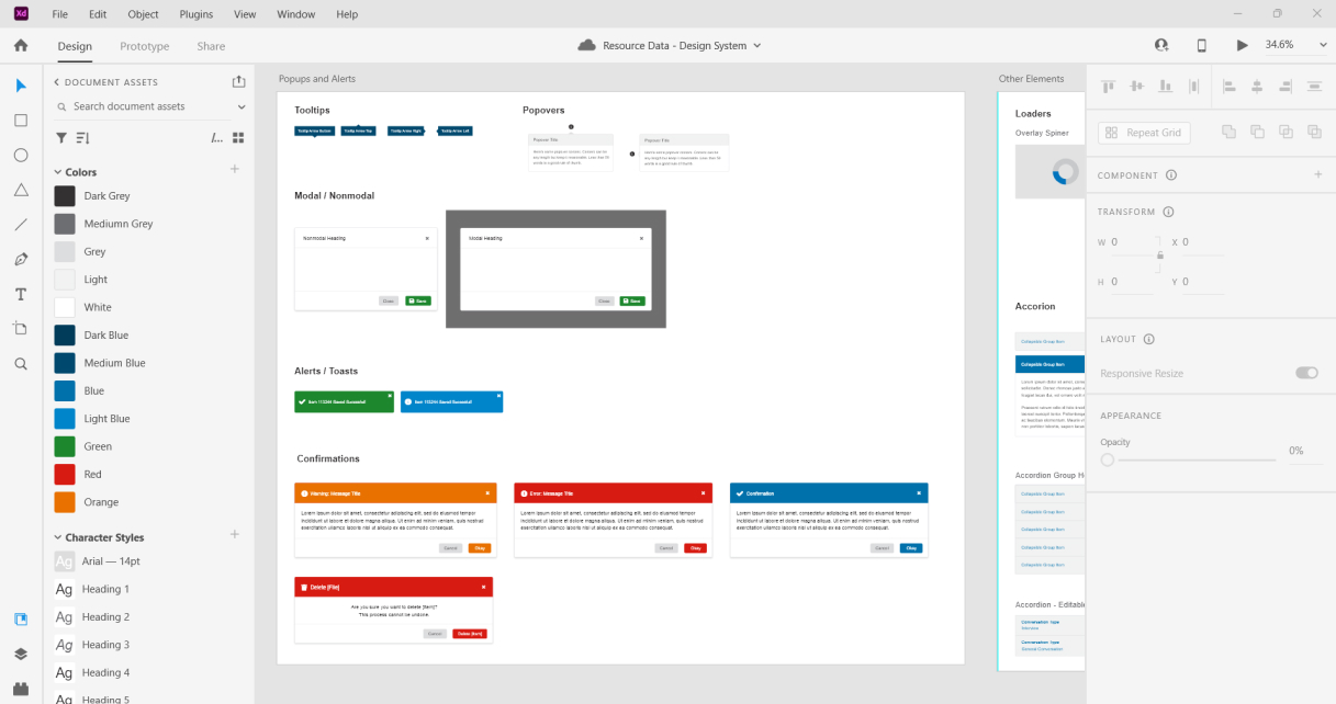
Tooltips, popovers, help buttons
Notifications
Success, error, warning messages
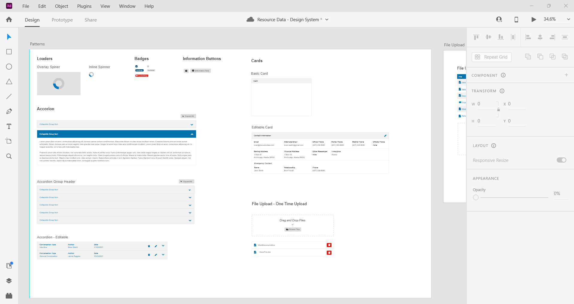
File Uploads
Single file upload, file management directory
Loaders and Spinners
Inline content loading, action spinners
Cards and Accordions
Collapsible sections, visual grouping
Validation Feedback
Inline form validation
Modals and Alerts
Confirmation dialogs, informational modals
Typography
Headings, paragraphs, labels, notes
Color Palette
Primary, secondary, and neutrals
Page Templates
Single page, subsite
Researching and defining best practices
We kicked off with in-depth research, pulling insights from trusted sources like Nielsen Norman Group and UX Collective while benchmarking against tools like JIRA and LinkedIn. Working within the Bootstrap Library, we made minor tweaks to enhance style and functionality. Each UI element and workflow was documented in a detailed guide with purpose, usage, and design examples, ensuring a perfect blend of usability and efficient development.
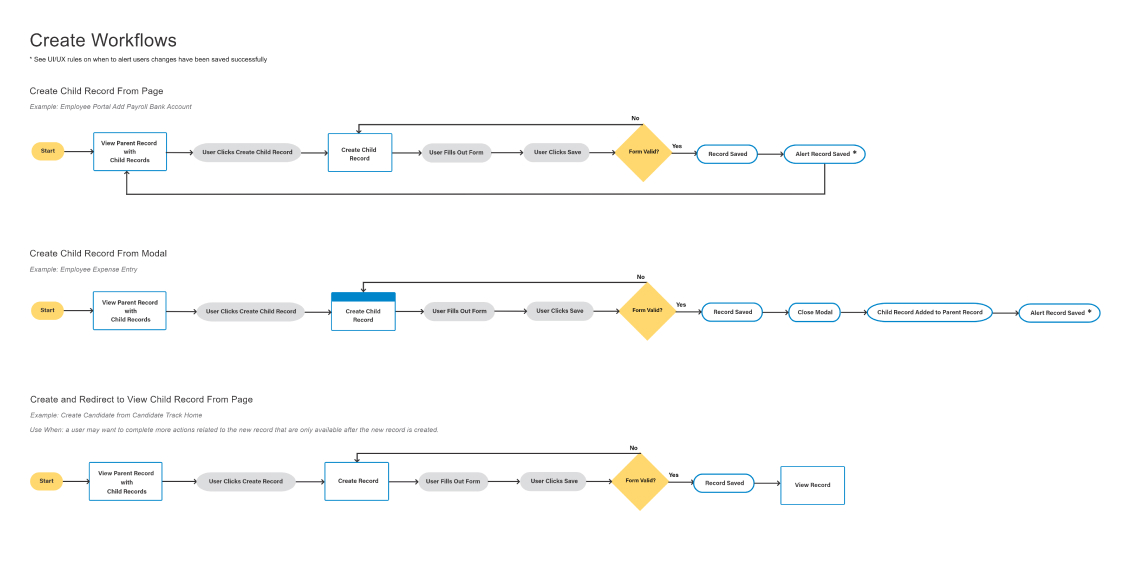
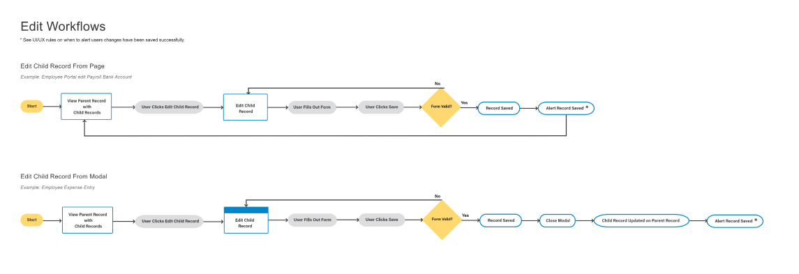
Mapping out the magic
Create workflows
Edit workflows
Collaboration in action
Our UX Standards team conducted collaborative reviews for each guide, focusing on UI elements and workflows. We debated guidelines, tested designs, and ensured alignment with usability and accessibility goals. This process refined details and built a shared vision for user-centered design. Approved guides were added to our centralized Design System, providing a unified resource for consistent, high-quality design.
- Debated guidelines and tested design examples to ensure usability and accessibility.
- Scrutinized functionality to align with user-centered design principles.
- Integrated approved guides into a shared Design System for organizational consistency.
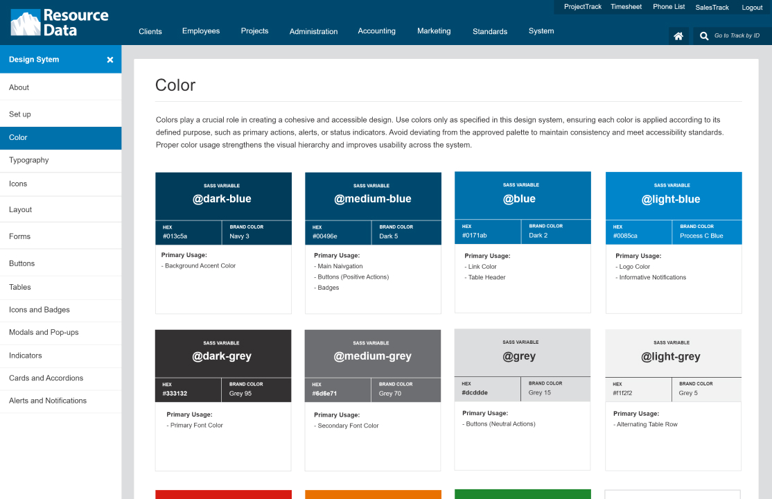
From guidelines to greatness
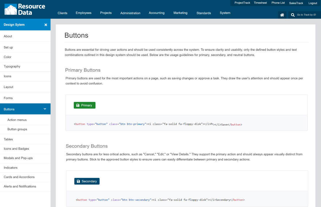
Color standards
Button standards
Intranet standards: The glow-up
With the foundation set, we focused on implementing the standards across Intranet pages. Working closely with stakeholders, we ensured each element was integrated correctly while resolving lingering UX pain points in their tools. This wasn’t just about applying design elements—it was about transforming workflows to better serve user needs, making every interaction intuitive and efficient.
Design impact
Enhanced trust
Thanks to improved workflows, users felt confident their work wouldn’t be lost. They could rely on consistent patterns, reducing frustration and errors.
Design impact
Accessibility wins
Accessible design rules improved user experiences, like standardized font sizes that enhanced readability without zooming.
Design impact
Efficiency gains
Consistent design patterns meant new employees could learn tools faster, and stakeholders spent less time wrestling with inconsistencies.
Design impact
Streamlined design
Consistent design patterns meant new employees could learn tools faster, and stakeholders spent less time wrestling with inconsistencies.
Reusable patterns
Lessons in communication
Building a design system is like tending a garden, requiring constant care and attention. And while the design system is ever-evolving, its foundation has set Resource Data’s Intranet up for years of success. Who knew cleaning up date pickers could feel so rewarding?
Design debates: The secret sauce
Engaging in thoughtful debates with fellow designers opens the door to fresh perspectives and innovative solutions. These conversations not only sharpen design skills but also help uncover opportunities for improvement that might have been overlooked.
Talking UX without the jargon
Explaining UX decisions to non-designers highlighted the importance of articulating the “why” behind every choice. This experience reinforced how clear communication fosters understanding and builds trust in the design process.

