DAIS
Transforming Alaska’s Dividend Application Information System (DAIS), the tool behind Alaska’s resident oil dividends
Important: Due to confidentiality requirements, images of the legacy DAIS system cannot be displayed. All mockups of the new DAIS contain fake user data.
Over 600,000 Alaskans apply each year for their Permanent Fund Dividend (PFD)—a share of the state’s oil revenue. Behind the scenes, the state of Alaska’s PFD employees use DAIS (Dividend Application Information System) to review, approve, and manage these applications. However, the outdated system had become cumbersome and inadequate for modern demands.
My role
Lead UX Designer
User interviews,
User workflows,
Mockups,
Prototypes,
Usability studies,
Accessibility,
HTML/CSS
Team
Project Manager (x1)
Technical Manager (x1)
Lead UX Designer (me)
Developers (X8)
Stakeholders (x6)
Project duration
January 2019 –
September 2022
A system stuck in time
DAIS was a desktop application that struggled under outdated technology and disorganized workflows. Employees had to navigate its rigid interface through complex steps, while the system’s inflexibility stifled new features. DAIS required a full-scale redesign to support modern workflows and adapt to evolving regulatory demands. As Lead UX Designer, I collaborated closely with project managers, stakeholders, and developers in an agile environment, driving the redesign through focused, three-week design sprints.
Meet the new DAIS
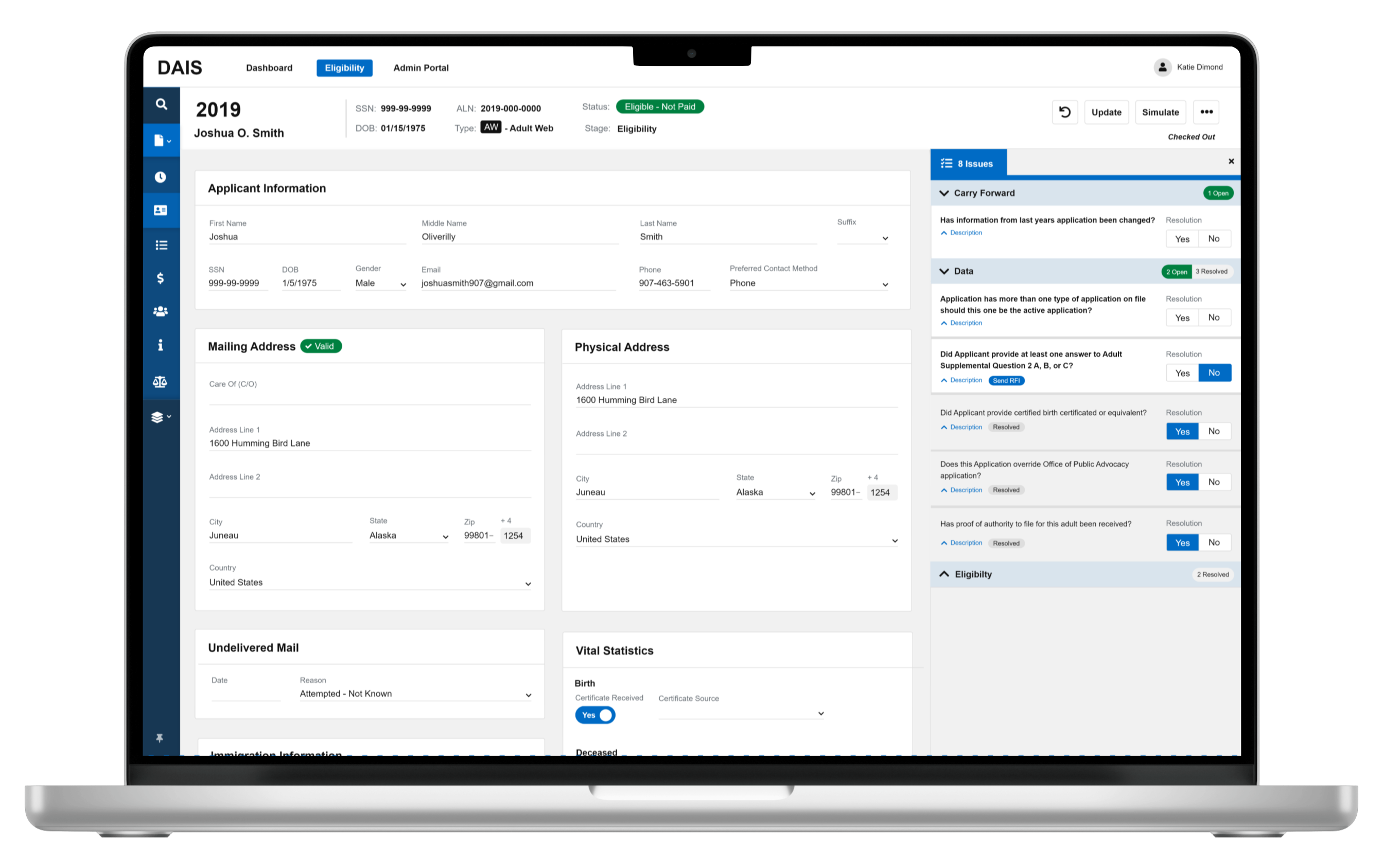
Important: All mockups of the new DAIS contain fake user data.
Shaping the future of DAIS
Before kicking off design sprints, I laid the groundwork with targeted research. By observing and interviewing Eligibility and Appeals Technicians, I uncovered their pain points, daily challenges, and improvement ideas. These conversations laid the foundation for reimagining a system designed to empower users and streamline their tasks, rather than hinder them.
Pain point
Time-wasting workflows
Essential tools were buried, forcing users to spend extra time searching for what they needed.
Pain point
Overwhelming complexity
With over 200 fields per PFD application, every screen was a complex puzzle, slowing decision-making and increasing errors.
Pain point
Poor design practices
With a fixed-width design, minimal color and iconography, and a lack of visual hierarchy, the interface made simple tasks difficult.
Pain point
Design without a system
DAIS was riddled with inconsistencies in fonts, buttons, and layouts, leading to a fragmented user experience.
In 2023, over 600,000 Alaskans applied for the PFD, with 85% successfully receiving their share—$1,312 per eligible resident.
Building DAIS, one sprint at a time
Step 1: Understanding the feature
User goals
Eligibility Technician

Process applications quickly
Easily find and address errors
Track application regulation compliance
User goals
Appeals Technician

Quickly review appeal cases
Access and analyze appeal documents
Keep detailed records of appeal outcomes
Step 2: Brainstorming and technical considerations
Clearly defined user stories allowed us to focus solely on using good design practices to build better features. We explored ideas through brainstorming, sketches, and How Might We sessions. Additionally, we discussed technical constraints with the development team, knowing that complex UIs would need to be created.
- How might we manage over 200 form fields without overwhelming users?
- How might we visually highlight errors for faster resolution?
- How might we design a flexible navigation when we don't know all the pages?
Step 3: Designing with purpose
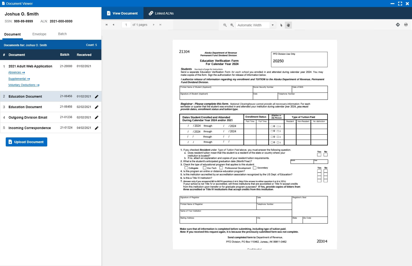
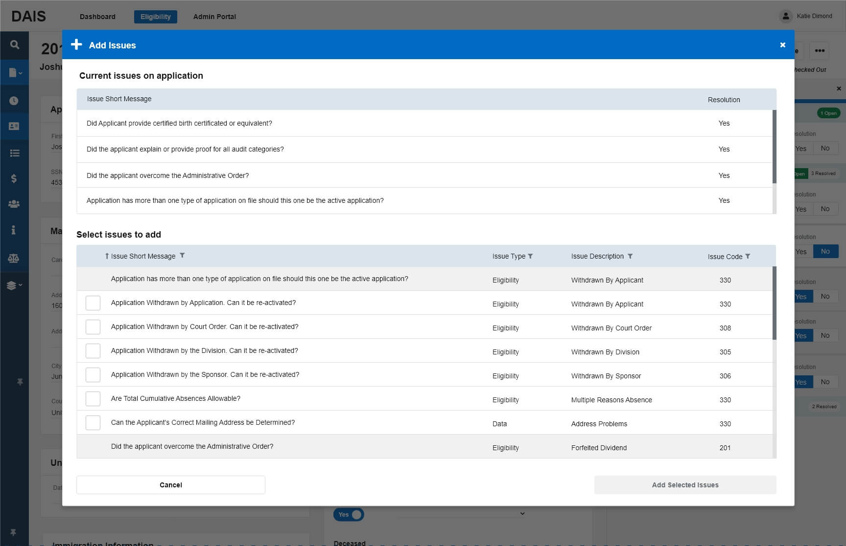
Designing mockups and prototypes was a collaborative, user-centered process. A minimalist interface with bold colors highlighted key areas, while technical discussions with developers addressed complex UI needs like dual-screen tasks, digital documents, and modals. We also ensured WCAG accessibility guidelines were met with proper field labels, elements, tooltips, and a clear visual hierarchy.
Application - infosys
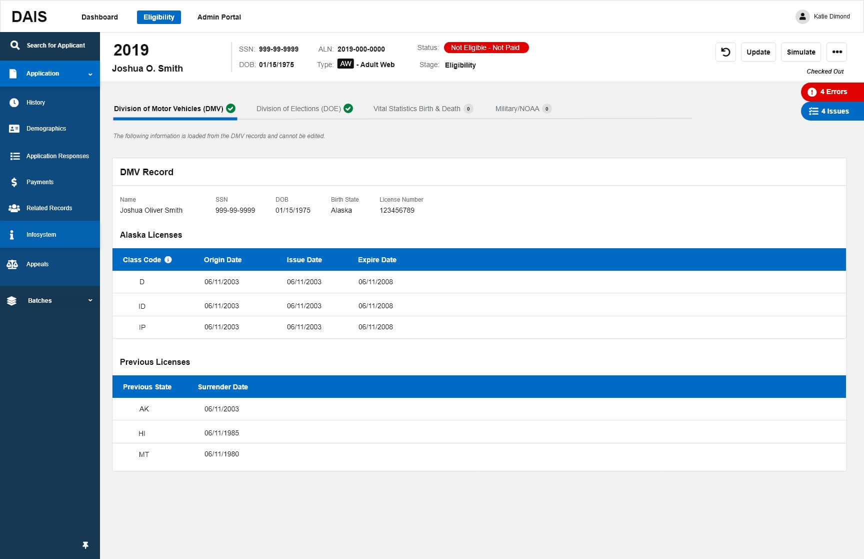
Document viewer - dual screens
Add application issue
Step 4: Testing and iteration
Moderated and unmoderated usability testing gathered valuable insights from key users, ensuring the system addressed known issues and introduced improvements to make their workflows more efficient. Each sprint saw at least two rounds of iteration, refining designs to enhance user workflows and meet regulation requirements.
Design improvement
Flexible navigation
A multi-level navigation system accommodated future pages and supported users in rapidly changing regulatory environments.
Design improvement
Form field organization
Fields were categorized on separate pages, with subcategories grouped in cards for easy scanning. Editable fields used lines instead of boxes, balancing clarity and flexibility.
Design improvement
Error highlighting
A dedicated errors panel and sticky “finger tabs” allowed quick navigation to flagged issues. Color-coded icons, such as purple for untested changes, provided clear visual cues.
Design improvement
Standardized Design
Elements were organized into a design library with best practices for using them. Ensuring consistency while streamlining the design process for greater efficiency.
Step 5: Delivery and documentation
Finalized prototypes were prepared for development, complete with detailed notes for seamless handoffs. The designs were demoed to developers, addressing questions and confirming functionality. New elements were incorporated into the design system, building a consistent foundation for future features while reducing redundancy.
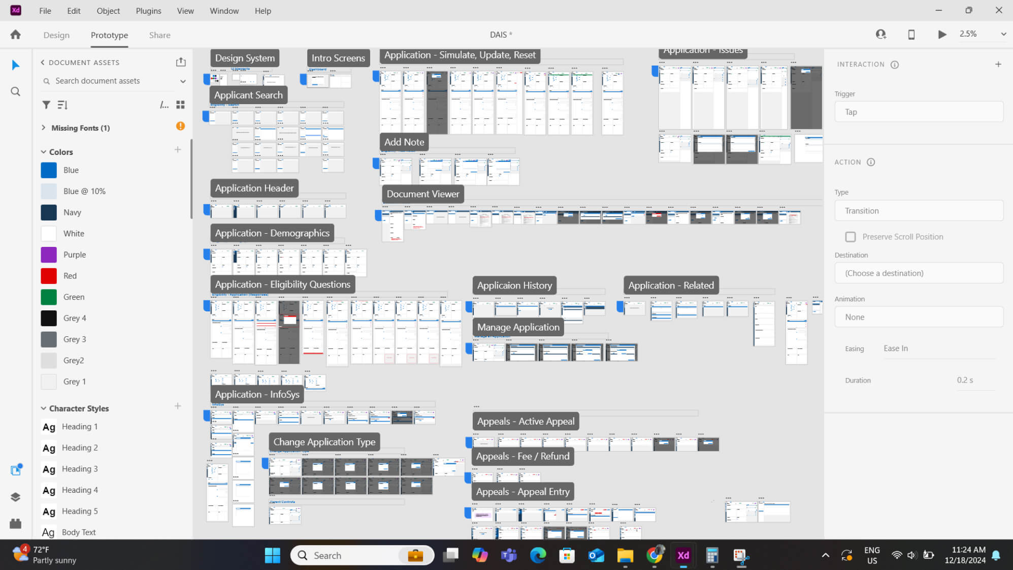
As a front-end developer turned UX Designer and at the team’s request, I helped polish the code for design elements. Mainly focusing on responsive layouts, CSS standardization, and pixel-perfect precision.
Outcomes and impact
Although I transitioned off the project before its final implementation, the redesigned DAIS system marked a transformative leap forward. By streamlining workflows, minimizing errors, and eliminating the frustrations of its predecessor, the new system empowered staff to work with confidence and efficiency.
Design improvement
Faster processing
Visual cues, error notifications, and improved hierarchy helped staff process applications faster and more accurately.
Design improvement
Efficient workflows
Users appreciated the modernized interface, which reduced the cognitive load and made their workflows smoother.
Design improvement
Future-ready design
The new web application and design system were built to evolve, accommodating regulatory changes without extensive rework.
Lessons in design
The DAIS project was full of challenges that pushed me to grow as a UX designer, honing my skills in managing large-scale, long-term projects as a design lead. From teaming up with developers to taming massive design files, each hurdle had a lesson that shaped the project’s success and how I’ll tackle future ones.
Developers are a designer's best friend
Good design doesn’t stop after handing the prototypes to the developers. Clear communication with the development team is crucial. When design needs changed, working closely with developers helped us resolve issues quickly and ultimately created a better product.
Perfection isn't always necessary
Getting every pixel perfect is not always possible in large projects with tight timelines. While striving for the best user experience is essential, prioritizing features over perfection results in a more valuable product.

